Client Case Study
Pikluski Law
Project Summary
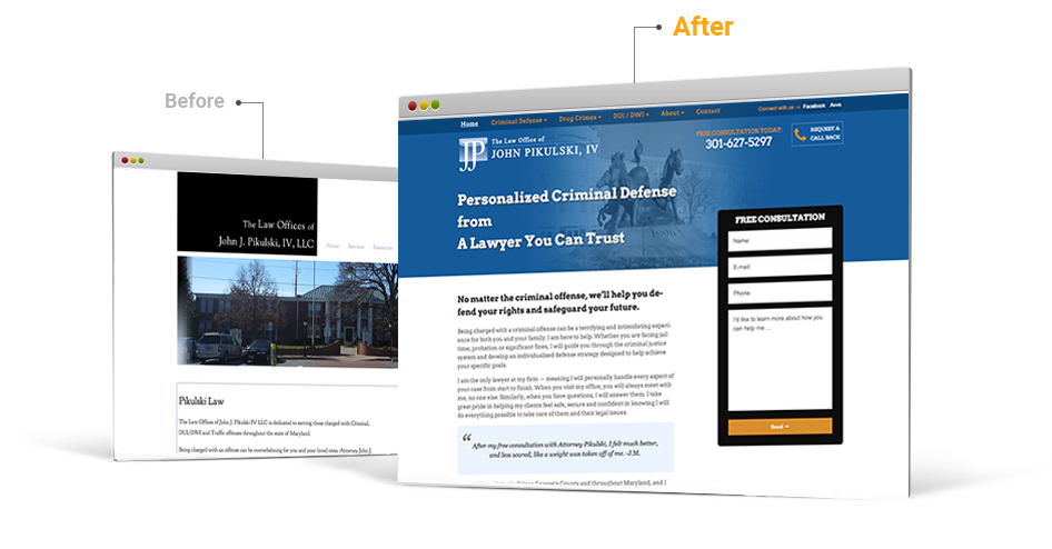
Pikulski Law chose us to move them away from an overpriced, underperforming provider and into a modern, responsive website platform that would give them more flexibility and a mobile design that compels action.
Learn more


Mobile Sites that Drive Conversion
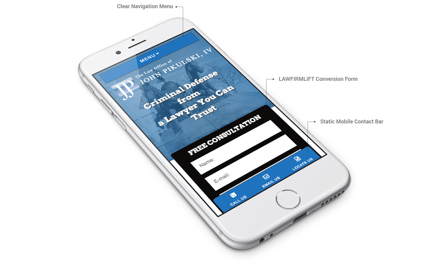
Since over 50% of site visitors visit on mobile devices we take the unique look of our clients’ mobile sites very seriously. Pikulski’s site shows quick call and email buttons that make it easy for mobile visitors to reach out immediately.

Thank you! On a tight deadline, you guys delivered. I was previously paying too much for too long with no real ROI. We have a better presence now & more control over our lead growth.John Pikulski, Attorney

Conversion-Based Design
We redesigned the site to make sure the call to action was very clearly visible on the top 50% of the site. We also added subtle animations to make the site presentation more dynamic, emphasize the firm’s core specialty and further emphasize the call to action form.
Hover to view full homepage layout

Live Lead Reporting & Savings
The migration saved the firm over $15,000 in the first year alone—this is money the firm reinvests directly into flexible, transparent pay-per-click digital marketing that can tracked and measure with the built-in site analytics dashboard that comes standard with each site.

